


The animation below shows the change in risk levels for COVID-19 transmission in Massachusetts communities, from August through October 2020. Red denotes cities and towns at the highest risk level, followed by yellow and green. I used R to clean and analyze weekly datasets from the Massachusetts Department of Public Health, and to generate the maps. I created the animation in Adobe Photoshop.

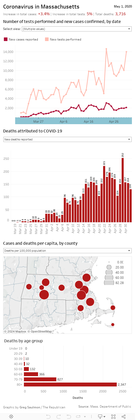
I created the dashboard below for MassLive.com in the early days of the pandemic. I set up a project in Google Sheets to feed the visualizations in Tableau Public. The data came from daily releases by the state’s Department of Public Health. Some of the metrics were drawn directly from the state’s data, while others — such as increases in cases and testing, per capita cases and deaths, and mortality rates — were drawn from my own analyses.
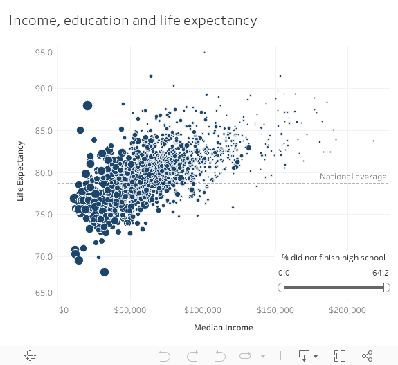
The chart below shows the relationship in Massachusetts census tracts between life expectancy at birth (y axis) and two variables: median income (x axis), and the percent of the population that did not finish high school (dot size). Each dot represents one census tract. Use the slider in the lower right to filter tracts by the percentage of residents who did not finish high school. This chart accompanied a story about health disparities and life expectancy in Massachusetts.
I built the chart below to illustrate figures from the Massachusetts Center for Health Information and Analysis. My work cleaning and interpreting the raw dataset served as the starting point for a story on the impact of federal COVID-19 relief on hospital finance.